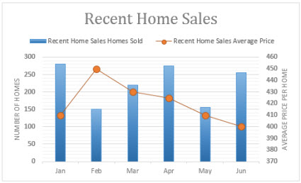
When the numbers in a chart vary widely from data series to data series, or when you have mixed types of data (price and volume), plot one or more data series on a secondary vertical (value) axis. The scale of the secondary vertical axis shows the values for the associated data series. A secondary axis works well in a chart that shows a combination of column and line charts. You can quickly show a chart like this by changing your chart to a combo chart.

-
Select a chart to open Chart Tools.
-
Select Design > Change Chart Type.
-
Select Combo > Cluster Column - Line on Secondary Axis.
-
Select Secondary Axis for the data series you want to show.
-
Select the drop-down arrow and choose Line.
-
Select OK.
Add or remove a secondary axis in a chart in Office 2010
When the values in a 2-D chart vary widely from data series to data series, or when you have mixed types of data (for example, price and volume), you can plot one or more data series on a secondary vertical (value) axis. The scale of the secondary vertical axis reflects the values for the associated data series.

After you add a secondary vertical axis to a 2-D chart, you can also add a secondary horizontal (category) axis, which may be useful in an xy (scatter) chart or bubble chart.
To help distinguish the data series that are plotted on the secondary axis, you can change their chart type. For example, in a column chart, you could change the data series on the secondary axis to a line chart.
Important: To complete the following procedures, you must have an existing 2-D chart.
Source: Microsoft
